Our car has a feature called auto-hold. When turned on, you can bring the car to a stop, then take your foot off the brake and the car will keep the brake held for you until you press the accelerator. I really like this feature, but I’ve noticed that when I use it, I frequently hear a very high-pitch squeal from the driver’s side cabin. At first, I wasn’t sure if it was just my ears ringing, but I can reproduce it every time. Because the sound is so high-pitched, and because it’s relatively quiet, I wondered if there was a way that I could prove the sound was really there.
## The game plan
1. Record the sound with and without auto-hold (plus a baseline from a quiet room)
2. Perform spectrum (Fast Fourier Transform) analysis on the audio to examine the amplitude at different frequencies
3. Compare the spectrum plots from all three scenarios and look for anomalies
## Recording
Recording was easy enough. The iPhone has a Voice Memos application that can capture recordings of arbitrary length. I wasn’t sure if the built-in microphone had the range required to capture the noise, but I’d find out soon enough. I took 3 recordings of both scenarios:
* With auto-hold: Turn on auto-hold, bring the car to a stop, then record 10 seconds of audio
* Without auto-hold: Turn off auto-hold, bring the car to a stop, then record 10 seconds of audio
## Spectrum Analysis
With recordings in hand, it was time to have a look at a spectrum analysis. Spectrum analysis is something that blows your mind the first time you see it. The process uses some very fancy maths to break a signal (recording) apart in to a histogram of the various frequencies that make up the sound in the recording. The x-axis is frequency (pitch), and the y-axis is amplitude (volume). It’s important to note that amplitude is measured in decibels (dB). Decibels are not linear. They’re actually logarithmic. Keep that in mind when we get to the graphs.
The open source audio editing application, Audacity, has the ability to perform [FFT spectrum analysis](http://manual.audacityteam.org/o/man/plot_spectrum.html) using a variety of algorithms. I transferred the audio from my iPhone to my Mac using iTunes, tediously dragged the files out of iTunes and renamed them (grrrrr), then imported them in to Audacity. I had to discard one of my auto-hold recordings because I forgot to turn the stereo off (it was quiet, but still there). Duh! Fortunately, I made three recordings.
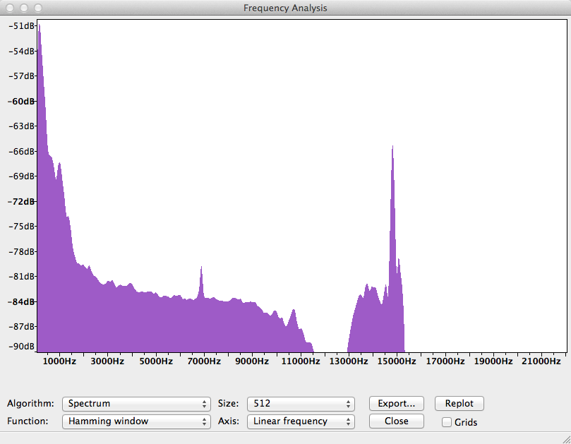
With the audio imported in to Audacity, I selected the audio for a single track, then clicked Analyze, Plot Spectrum. I used Hamming window for my FFT analysis, which is a good general-purpose windowing algorithm. The result for an auto-hold recording looked like this:
While the spectrum plots in Audacity looked amazing, it’s not possible to compare more than one at a time. Fortunately, there’s an export button that gives us a tab-separted text file with all the computed values. Looks like a great job for GNUPlot.
## Comparison of Data
To compare the spectrum data, I exported the data to files: auto_hold.tsv, brake_hold.tsv, and ambient_room.tsv. I then used the following GNUPlot config to plot the graph:
# Let’s output to a jpeg file
set terminal jpeg size 810,600
# set terminal x11 size 810,600
# This sets the aspect ratio of the graph relative ot the size
set size 1, 1
# The file we’ll write to
set output “x3-autohold-spectrum-analysis.jpg”
# The graph title
set title “BMW X3 Audio Spectrum Analysis” font “Arial Bold,13”
# Where to place the legend/key
set key left top
# Draw gridlines both the x and the y axis
set grid y
set grid x
# Label the x-axis
set xlabel ‘Frequency Hz’
# Use a small font so we can fit more labels on the x axis
set xtics rotate by 40 offset -1,-1.15 font “Arial,9” autofreq 1000,1000
# Only plot from 50 Hz to 15,400 Hz
set xrange [50:15400]
# Label the y-axis
set ylabel “Amplitude (dB)”
# Tell gnuplot to use tabs as the delimiter instead of spaces (default)
set datafile separator ‘\t’
# Plot the data
plot “./auto_hold.tsv” every ::2 using 1:2 title ‘Auto-Hold’ with lines, \
“./brake_hold.tsv” every ::2 using 1:2 title ‘Brake-Hold’ with lines, \
“./ambient_room.tsv” every ::2 using 1:2 title ‘Quiet Room’ with lines
The result:
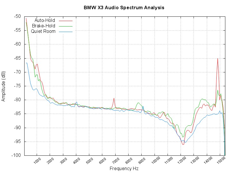
The quiet room plot gives us a good baseline for the noise profile of the recording equipment. Obviously, I don’t have a proper quiet room, but this should allow us to make relative judgements. The dB values on the y-axis are relative attenuation. That’s a fancy way of saying, “the sounds at this frequency were Y dB less than the maximum possible sound level”. We have to look at audio from an attenuation standpoint, because there is no absolute loudness when it comes to audio recording. You have a ceiling, from which you can relate to everything else.
The culprit sticks out like a sore thumb. When using auto-hold, there is a massive spike between 14 kHz and 15 kHz. Knowing that 20,000 Hz is about the upper boundary of human hearing, this looks like it should represent the sound I’m hearing. The actual peak values from the data files are:
Auto-hold: 14814.843750, -65.007362
Brake-hold: 14814.843750, -76.494194
That’s over 10 dB difference at the peak when auto-hold is on, versus when it’s off. Keep in mind that decibels are logarithmic, so the sound is over 10 times louder when using auto-hold! What’s interesting is that there is still some production of sound in that frequency during normal operation. They’re just not loud enough for me to hear. The car really is making an obnoxious sound when using auto-hold!
The only remaining question is whether the service department will take this as evidence of my claim, or whether they’ll just go all glassy-eyed on me and walk away. Either way, this was a lot of fun.