*Update: After some reflection and good feedback on [Hacker News](https://news.ycombinator.com/item?id=5557742), I should be clear that the graph output by the first method isn’t “wrong”, but rather (very) commonly misunderstood. I plan on doing a future blog post where I look at both graphs in more detail and try to find better ways to visualize the data.*
I should know. I’m a domain expert in “doing it wrong”. I’ve also seen this done in more than one place, so I’m going to memorialize my incompetence with Gnuplot in this blog post.
Does this invocation look familiar? This is a simple example of an Apache Bench command that will run a benchmark against the specified server.
ab -n 400 -c 10 -g apache-1.tsv “http://example.com”
^[1] ^[2] ^[3] ^[4] ^[5]
I’ll break it down.
1. `ab`: The Apache Bench benchmarking utility
2. `-n 400`: The number of requests for your benchmark (yes, this one is crazy small; it’s so people don’t hammer example.com by copy pasting)
3. `-c 10`: Number of concurrent requests
4. `-g apache-1.tsv`: This tells ab to write a “gnuplot-file” (that’s right from the man page)
5. `”http://example.com”`: The URL you want to benchmark against
If you’ve used Apache Bench much, you’ve probably discovered the `-g` switch already. The man page tempts you with the suggestion that “This file can easily be imported into packages like Gnuplot”. The words “easily” and “Gnuplot” should not be spoken in the same sentence. This is not because Gnuplot is a bad tool; it is that Gnuplot is so insanely powerful that few people understand how to use it. Up until this afternoon, I was misusing it as well.
You’ve probably generated a graph from your Apache Bench Gnuplot file that looks something like this:
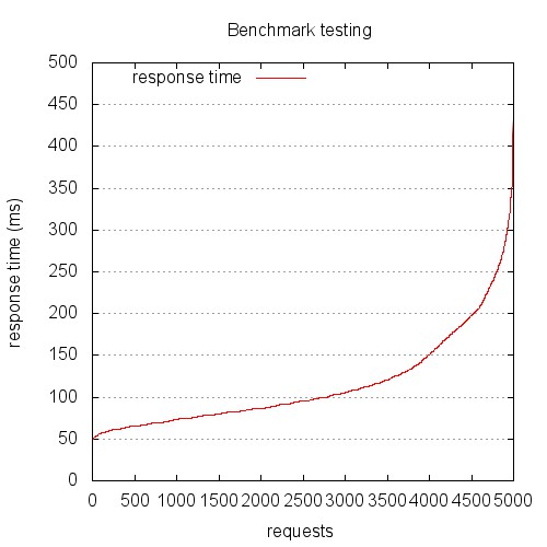
This is the graph you get if you treat the gnuplot file provided by Apache Bench as a log file. This graph is probably not showing what you think it does. Hint: this is not response (ms) over chronologically ordered requests.
The problem is, the file output by Apache Bench is not a log file, it’s a data file. Log files are (generally) written serially, so we can treat the sequence of the lines synonymously with time sequence. Let me stop here for a second and make this clear…
**The file output by the -g switch of Apache Bench is NOT in time sequence order. It is sorted by ttime (total time).**
Yikes. Yes, I am embarrassed that it has taken me this long to realize that, but I’m not alone, so here we are.
The other problem is that the common invocations of gnuplot found scattered around the Internet mistreat this file. Below is a very common example, but even this includes some elements that common scripts miss. The key to spotting the error is in the `plot` line. The sequence-based graph (above) was created using a Gnuplot script that looks like this:
# Let’s output to a jpeg file
set terminal jpeg size 500,500
# This sets the aspect ratio of the graph
set size 1, 1
# The file we’ll write to
set output “graphs/sequence.jpg”
# The graph title
set title “Benchmark testing”
# Where to place the legend/key
set key left top
# Draw gridlines oriented on the y axis
set grid y
# Label the x-axis
set xlabel ‘requests’
# Label the y-axis
set ylabel “response time (ms)”
# Tell gnuplot to use tabs as the delimiter instead of spaces (default)
set datafile separator ‘\t’
# Plot the data
plot “data/testing.tsv” every ::2 using 5 title ‘response time’ with lines
exit
Let’s look at the `plot` line in more detail:
plot “data/testing.tsv” every ::2 using 5 title ‘response time’ with lines
^[1] ^[2] ^[3] ^[4] ^[6] ^[7]
All of what I’m about to summarize is available in a much more detail in the gnuplot help pages, but here’s the tl;dr version:
1. `plot` draws a data series on the graphing area
2. This is the path to the input datafile
3. Think of `every` as in “take every X rows”, only a *lot* more powerful; in our case, `::2` means start at the second row
4. `using` allows you to specify which columns to use; we’ll use column 5, ttime (total time)
5. An explicit `title` for the series we’re plotting
6. Plot `with` lines
The problem is that we haven’t specified any x-axis ordering value. We’ve only specified that the values in column 5 should be used. Gnuplot will happily render our series for us.
The resulting graph has always puzzled me, and my bewilderment caused me to discard it and rely only on the data output by the Apache Bench report, rather than the graphs. If your graphs look anything like this, you’re looking at a request time distribution plot, with longer requests to the right, and shorter requests to the left. Hence the S-curve. It’s a fun graph, but it’s probably not telling you what you think it is.
Most people want to look at response (in ms) over time (seconds, serially). The good news is, everything we need is in the data file. Let’s look at a better Gnuplot script:
# Let’s output to a jpeg file
set terminal jpeg size 500,500
# This sets the aspect ratio of the graph
set size 1, 1
# The file we’ll write to
set output “graphs/timeseries.jpg”
# The graph title
set title “Benchmark testing”
# Where to place the legend/key
set key left top
# Draw gridlines oriented on the y axis
set grid y
# Specify that the x-series data is time data
set xdata time
# Specify the *input* format of the time data
set timefmt “%s”
# Specify the *output* format for the x-axis tick labels
set format x “%S”
# Label the x-axis
set xlabel ‘seconds’
# Label the y-axis
set ylabel “response time (ms)”
# Tell gnuplot to use tabs as the delimiter instead of spaces (default)
set datafile separator ‘\t’
# Plot the data
plot “data/testing.tsv” every ::2 using 2:5 title ‘response time’ with points
exit
We’ll look at the plot line in more detail:
plot “data/testing.tsv” every ::2 using 2:5 title ‘response time’ with points
^[1] ^[2] ^[3] ^[4] ^[5] ^[6]
I’m going to repeat myself some here, but I want this to be clear, so here we go.
1. `plot` draws a data series on the graphing area
2. This is the path to the input datafile
3. Think of `every` as in “take every X rows”, only a *lot* more powerful; in our case, `::2` means start at the second row
4. `using` allows you to specify which columns to use; we’ll use columns 2 and 5, seconds (unix timestamp) and ttime (total time)
5. An explicit `title` for the series we’re plotting
6. Plot `with` points (lines won’t work, as we’ll see below)
The resulting graph looks like this:
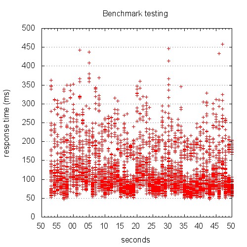
Yeah, I know. Right now, you’re scratching your head trying to figure out just what the hell you’re looking at. This is not the pretty line graph we thought we were going to get.
Here’s the thing: unless you’re testing something unrealistically simplistic, your response times aren’t going to be well represented by a single line at any given time.
Keep in mind a few things:
* We told Apache Bench to use concurrency 10
* Apache Bench is going to go all out
* The granularity of our time data is 1 second
The result is a graph that shows stacks of points. The graph above is difficult to read, because it’s rendered in such a small area. The version below is rendered at 1280 x 720. Give it a click to view the large version.

When you look at this graph, it becomes much clearer what’s going on. At each second of the test, there is a distribution of response times. The benchmark results I plotted are from one of the most complex JSON endpoints in our application. I also turned off caching so that the result would be computed each time. This made the data complex, but isn’t that what we’re after? If we can’t infer meaning from complex data, what good are our tools? Looking at this graph, I can see the distribution of response times, as well as the upper and low boundaries.
The scatterplot style graph is what I plan on using for now, but I think a candlestick chart or heatmap would probably be the best representation. I’m going to continue to work on the Gnuplot script until I have something really refined, so keep an eye out for updates!
[Comments welcome on Hacker News](https://news.ycombinator.com/item?id=5557742)