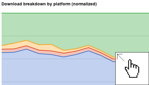
Author Amy Vernon wrote an [interesting piece showing the change in download volume by platform over time at Sourceforge](http://sourceforge.net/blog/os-wars/). Sourceforge is in an envious position from a data perspective. Few sites have as high a download volume for such a wide variety of projects. I thought it would be fun to put together some additional visualizations of the data. I started with some Excel charts, but user [warpdude](http://news.ycombinator.com/item?id=3248713) over at Hacker News turned me on to the idea of using the Google Visualization API. Just a couple of quick changes to the source of his example, and we have a set of interesting graphs showing the same time-series data.
**Update:** Rich Bowen provided an [insight via Twitter](https://twitter.com/rbowen/status/137305778875936771) that much of the “other” data is from update services and non-browser requests. Hello, curl. We’re looking at you!
**Update 2:** Have a look in the comments for an update from Rich Bowen further addressing the concerns regarding ‘other’.
[](http://res.bradlanders.com/wp-content/visualizing-sourceforge-data/sourceforge-combined.html)